Individual Project

Nourish

Duration
6 weeks
Type
Mobile First App Project
Team
Myself, Research Participants (friends & family)
role
UX Designer, UI Designer, Research
THE WHAT?
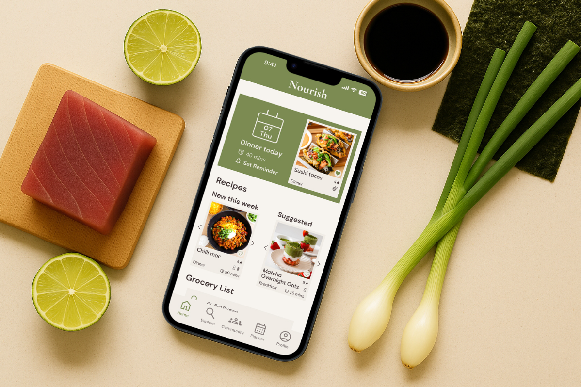
A recipe discovery app that creates personalised meal plans and auto-generates grocery lists. Designed to serve both cooking beginners and experienced home chefs.
THE WHy?
Rising takeaway reliance creates unhealthy, expensive eating habits, while meal kits lack variety and create waste. Nourish tackles these problems by making meal discovery and planning effortless.
THE how?
I designed personalised meal planning, smart recipe discovery, and automated grocery lists to transform cooking from a chore into an enjoyable experience.
Empathise

Understanding the user

Foundational Research
I used survey results from 10 participants to identify pain points in recipe discovery and grocery planning, uncovering opportunities to simplify meal prep and motivate home cooking.
Target User Research
Research revealed key pain points: finding fresh recipes and creating effective shopping lists. Users wanted social discovery features and integrated meal planning with automated grocery lists.
Pain Points
  • Meal Inspiration - Users struggle to find varied, nutritious recipes that meet dietary needs and allergies.
  • Grocery Planning - Users waste time manually creating lists and frequently forget items when shopping.
  • Cooking Motivation - Users lack motivation to cook regularly and try new recipes without external encouragement.
An interview participant gave me further insight into the problems they face
Define

Defining the Core User Problems

User Problem Statement

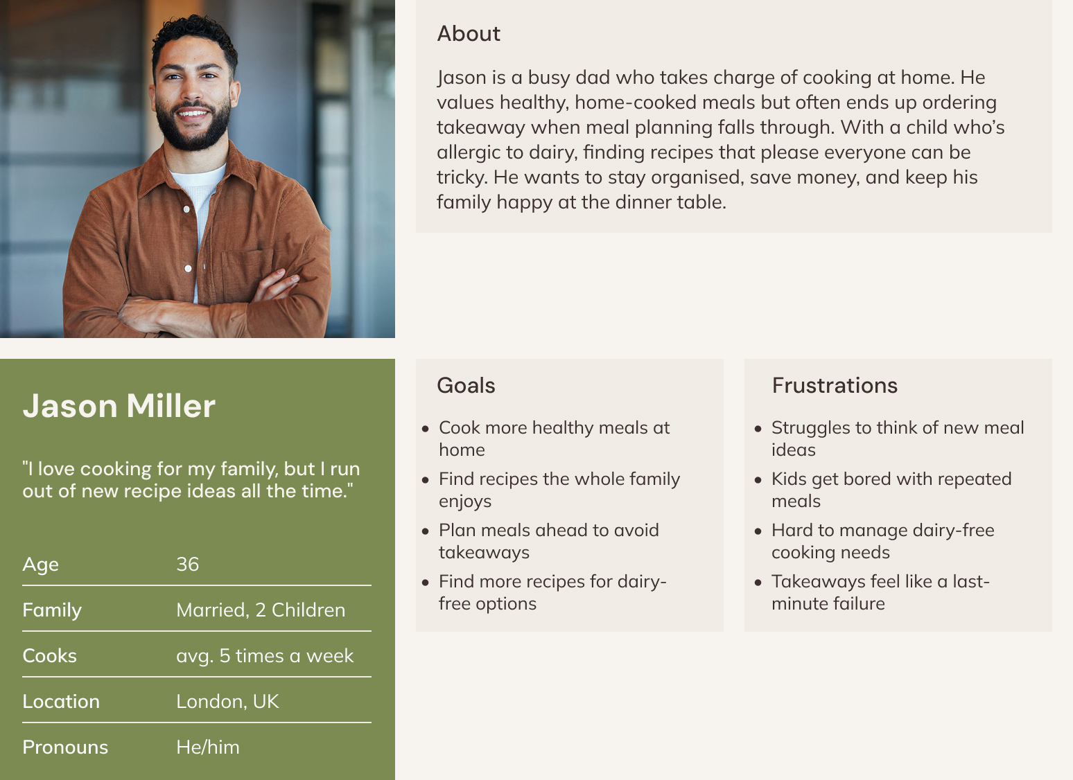
"Jason is a busy dad who needs quick access to varied dinner ideas, because his family get bored of eating the same meals. When he runs out of inspiration, he ends up ordering takeaway, which is more expensive and less nutritious than cooking at home."

Problems to Solve

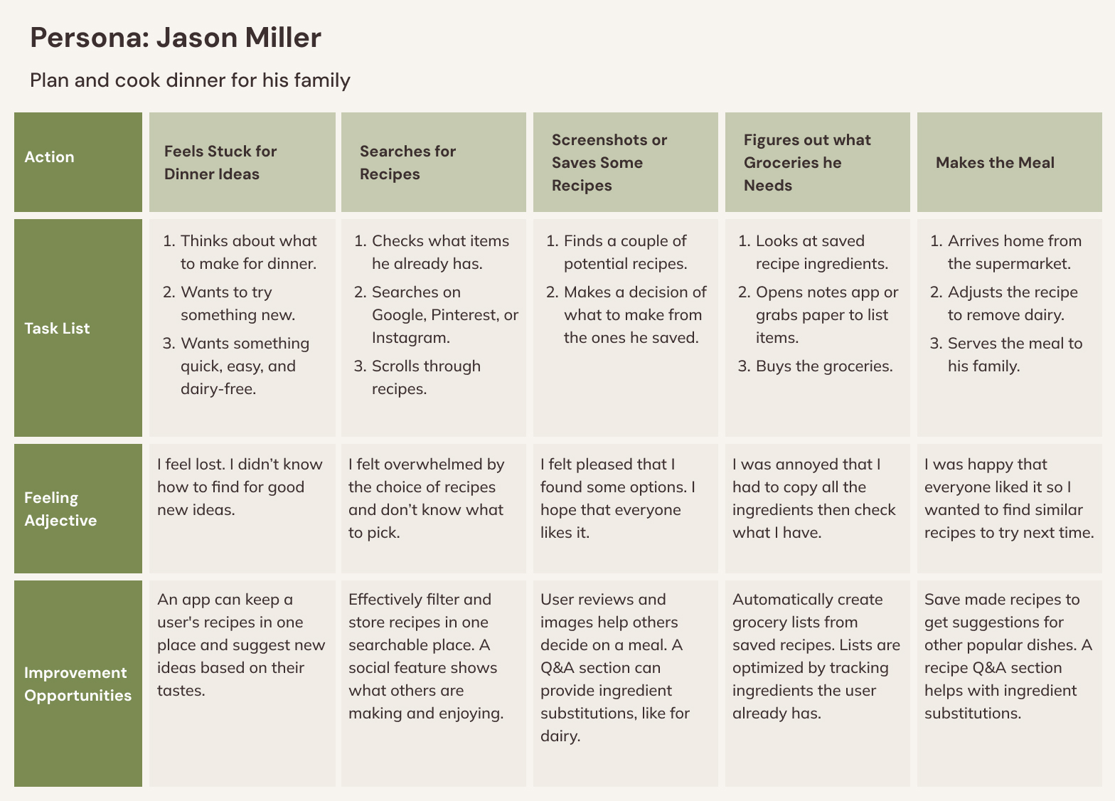
User Journey Map

Lack of Meal Variety
Users struggle to consistently find new, family friendly recipes - especially ones that cater to specific dietary needs like allergies.
Inefficient Meal Plan
Without a clear plan or inspiration, users often fall back on repetitive meals or costly takeaways.
Manual Grocery Lists
Creating shopping lists from scratch or copying ingredients from websites is time-consuming and often leads to forgotten items or last-minute store runs.

Competative Analysis

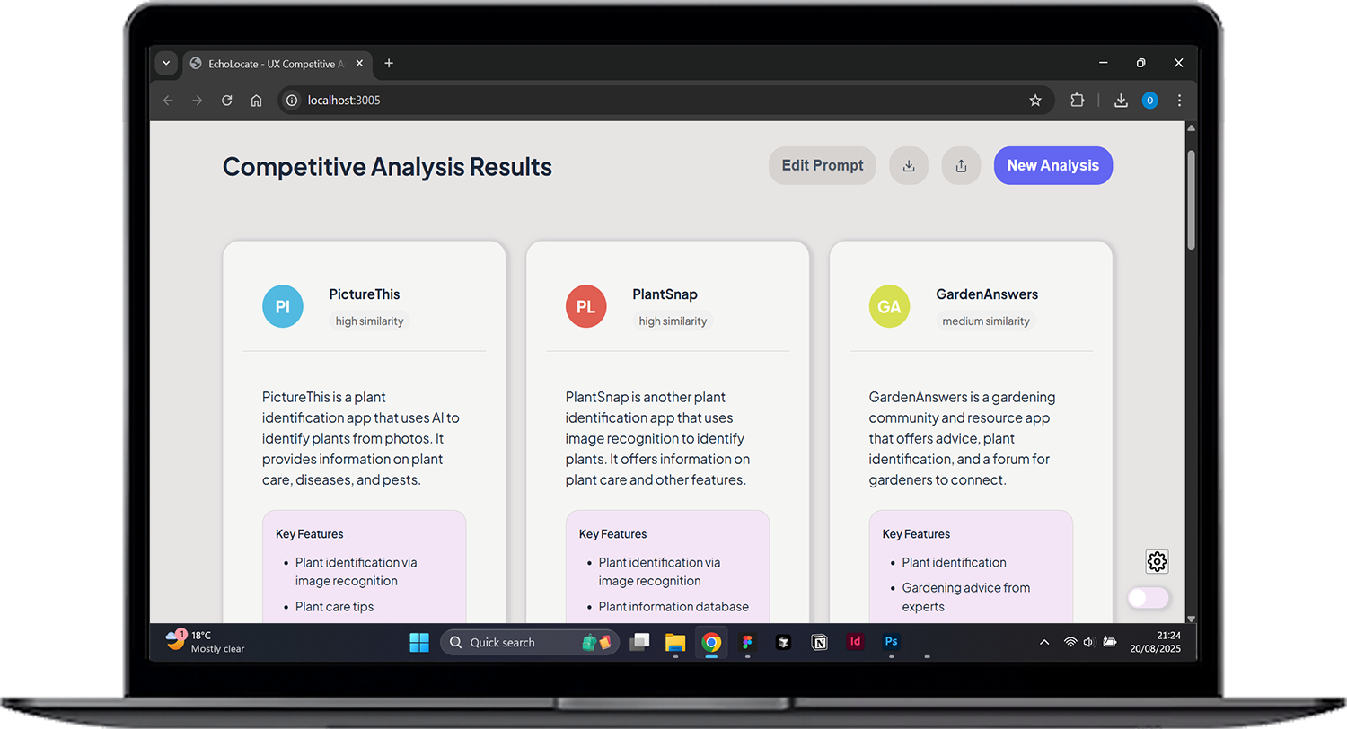
Key findings from analysing ReciMe revealed several opportunities for differentiation. Unlike ReciMe's paywall approach, Nourish will prioritise community building with freemium features, following successful models like Duolingo.

ReciMe lacks exploration and community features - core elements in my design. Whilst ReciMe offers useful ingredient quantity displays and grocery integration, users have to upload recipes from other platforms which creates friction and doesn't improve exploration.

Nourish will addresses this through curated, built-in recipes and dedicated community spaces to encourage cooking discovery.
Ideate

The Design Process

Early Exploration

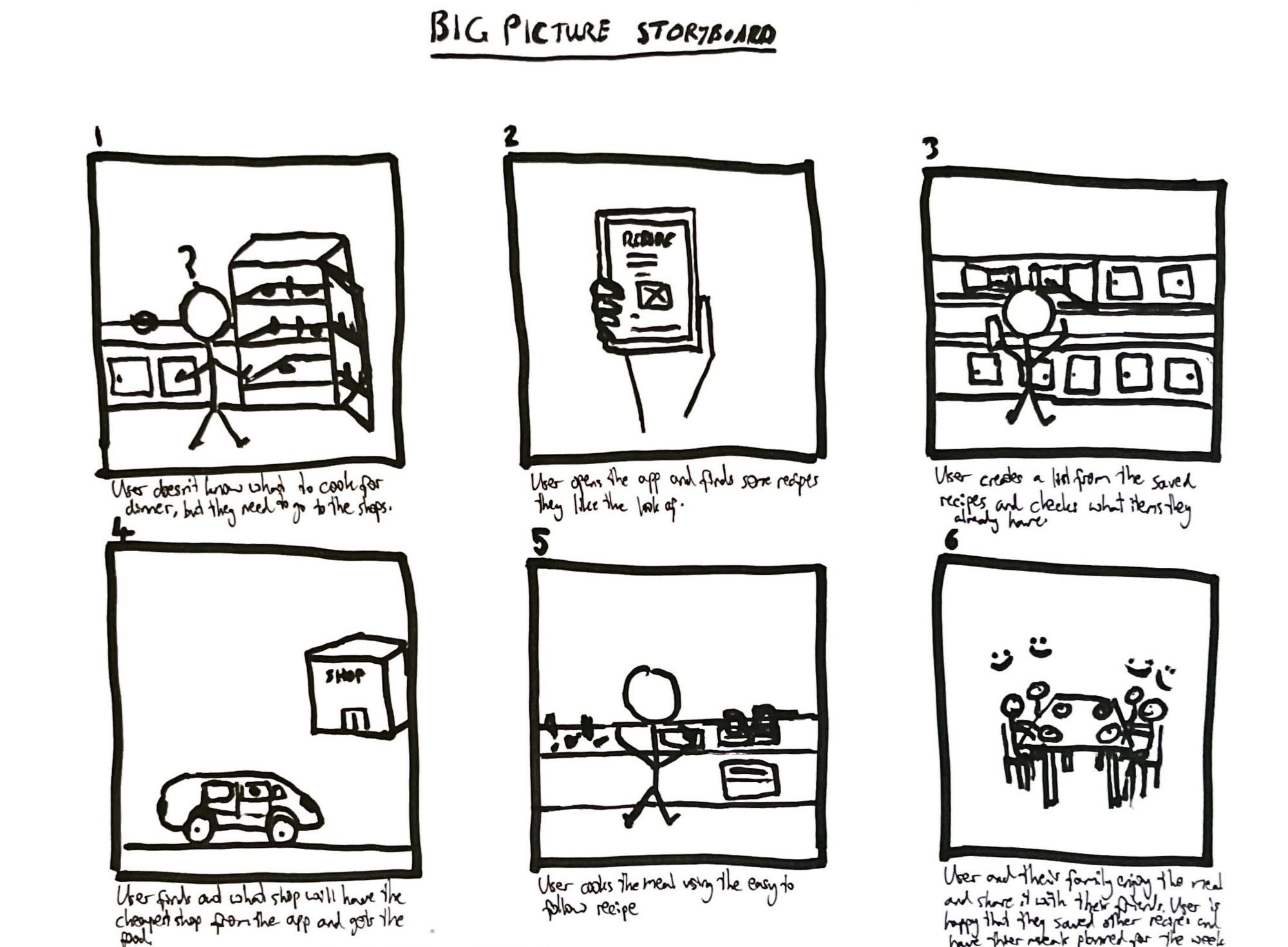
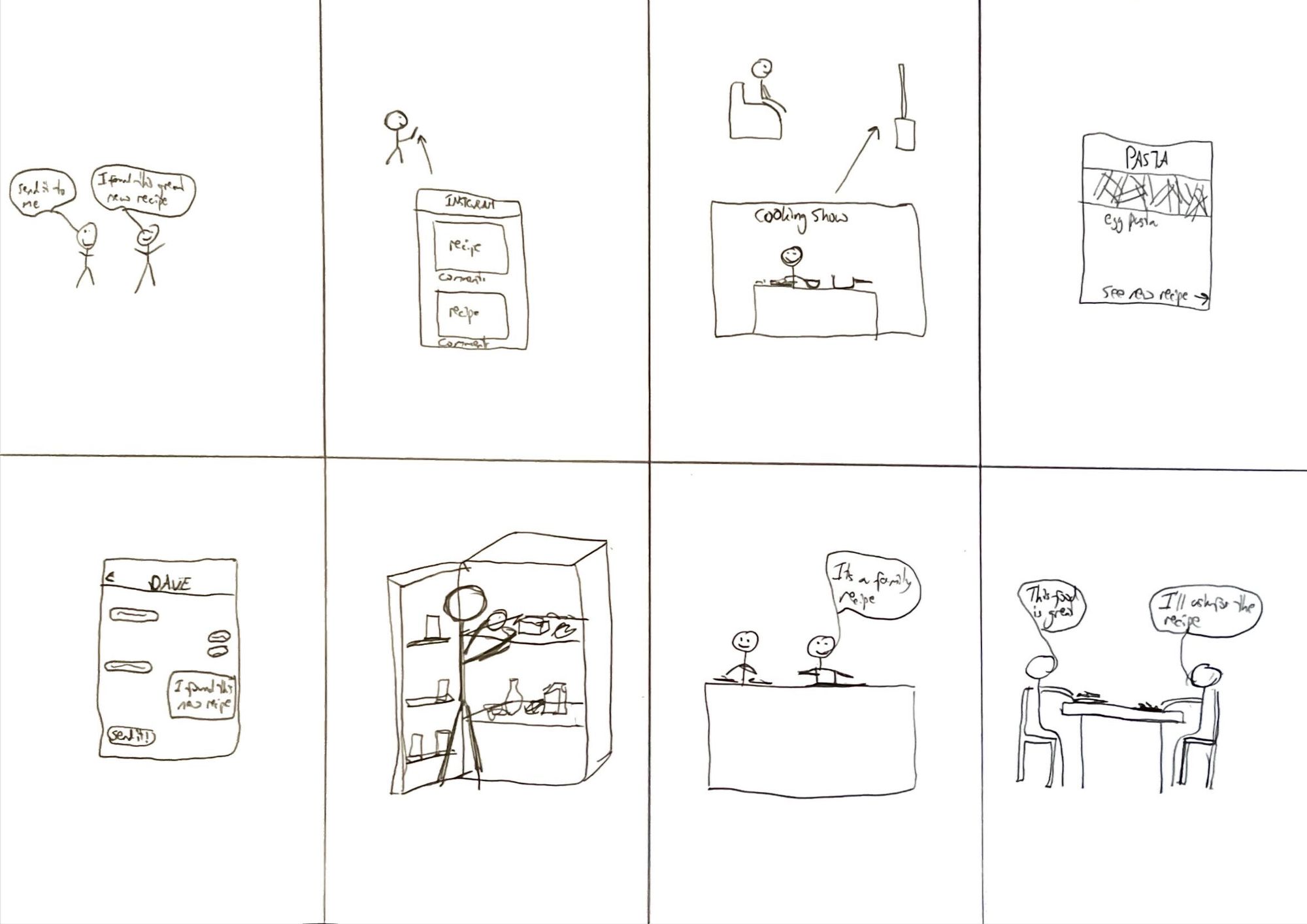
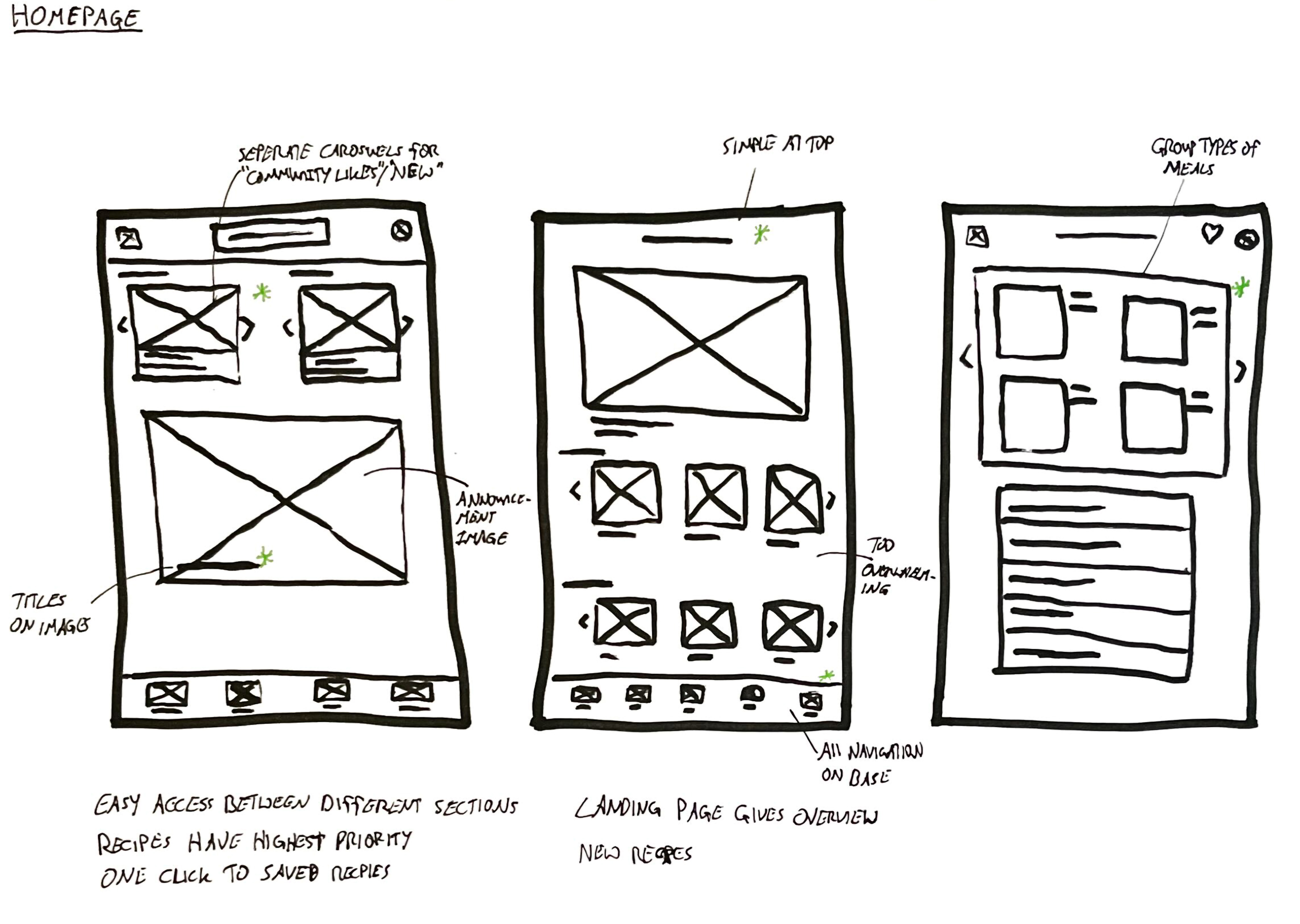
I mapped the current user experience from dinner planning frustration to successful home cooking through storyboarding, then generated diverse solution concepts using rapid Crazy 8s ideation to address key pain points.

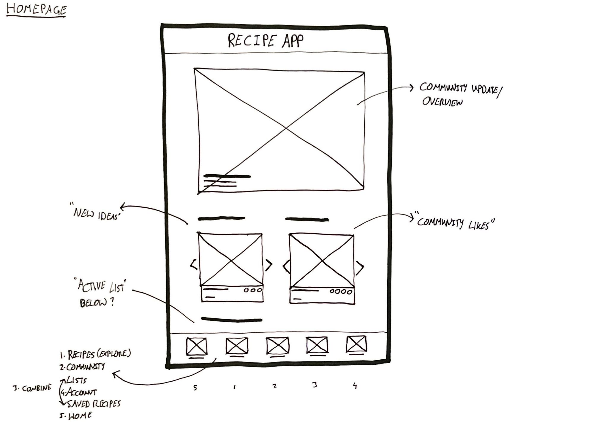
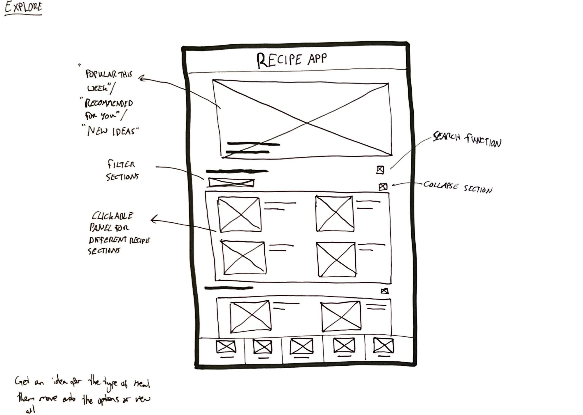
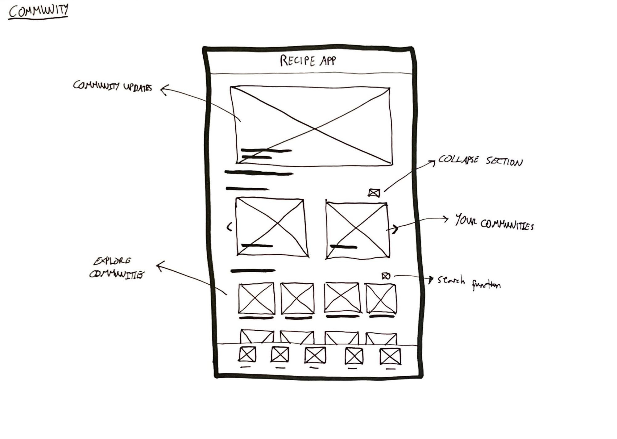
Initial Wireframes

I created wireframes to establish the core information architecture and user flow, focusing on recipe discovery, community features, and seamless navigation between key sections before moving to visual design.

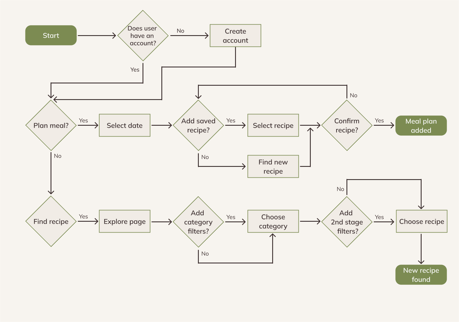
User Flow

I mapped the primary user journeys for meal planning and recipe discovery, identifying decision points and potential friction areas to ensure smooth navigation between core features.

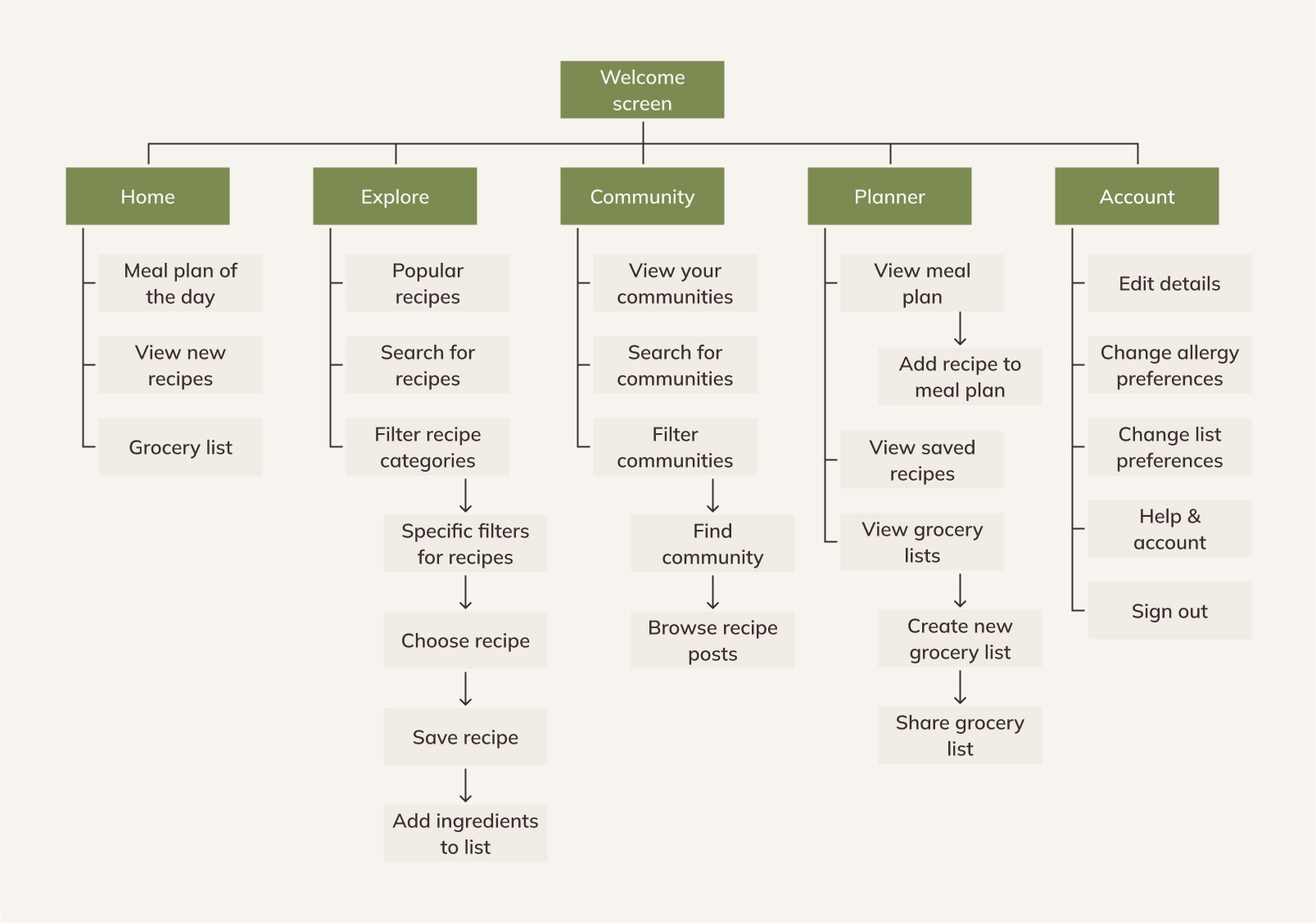
Information Architecture

The wireframes led me to structure the app's content hierarchy to support the main user goals: discovering recipes, planning meals, and engaging with the cooking community, ensuring logical navigation paths between features.
Lo-Fi Design

Initial Prototype & Feedback

Usability Testing

I conducted a monitored usability study with 3 participants to assess the lo-fi design and identify opportunites to improve the user experience
Clear Navigation
Users responded positively to the bottom navigation bar, as it allowed them to quickly move between different areas of the app.
Hero Sections
Users liked the idea of hero sections at the top of the screen to highlight important information but felt they were not always used effectively.
Recipe Exploration
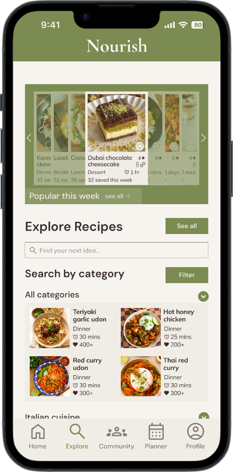
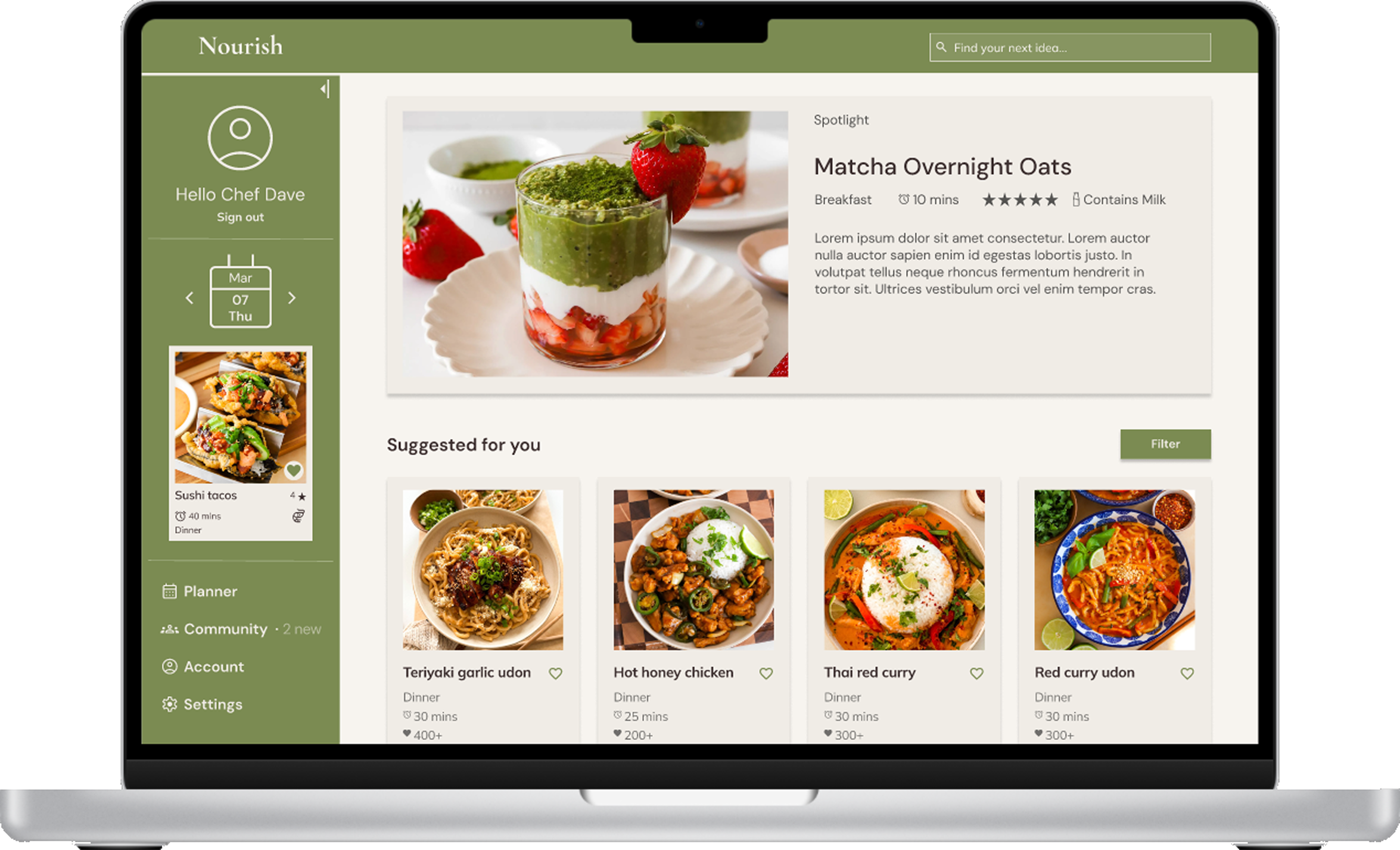
Users liked having multiple ways to explore recipes, including search, personalised suggestions, and browsing through categories.

Lo-Fi to Hi-FI

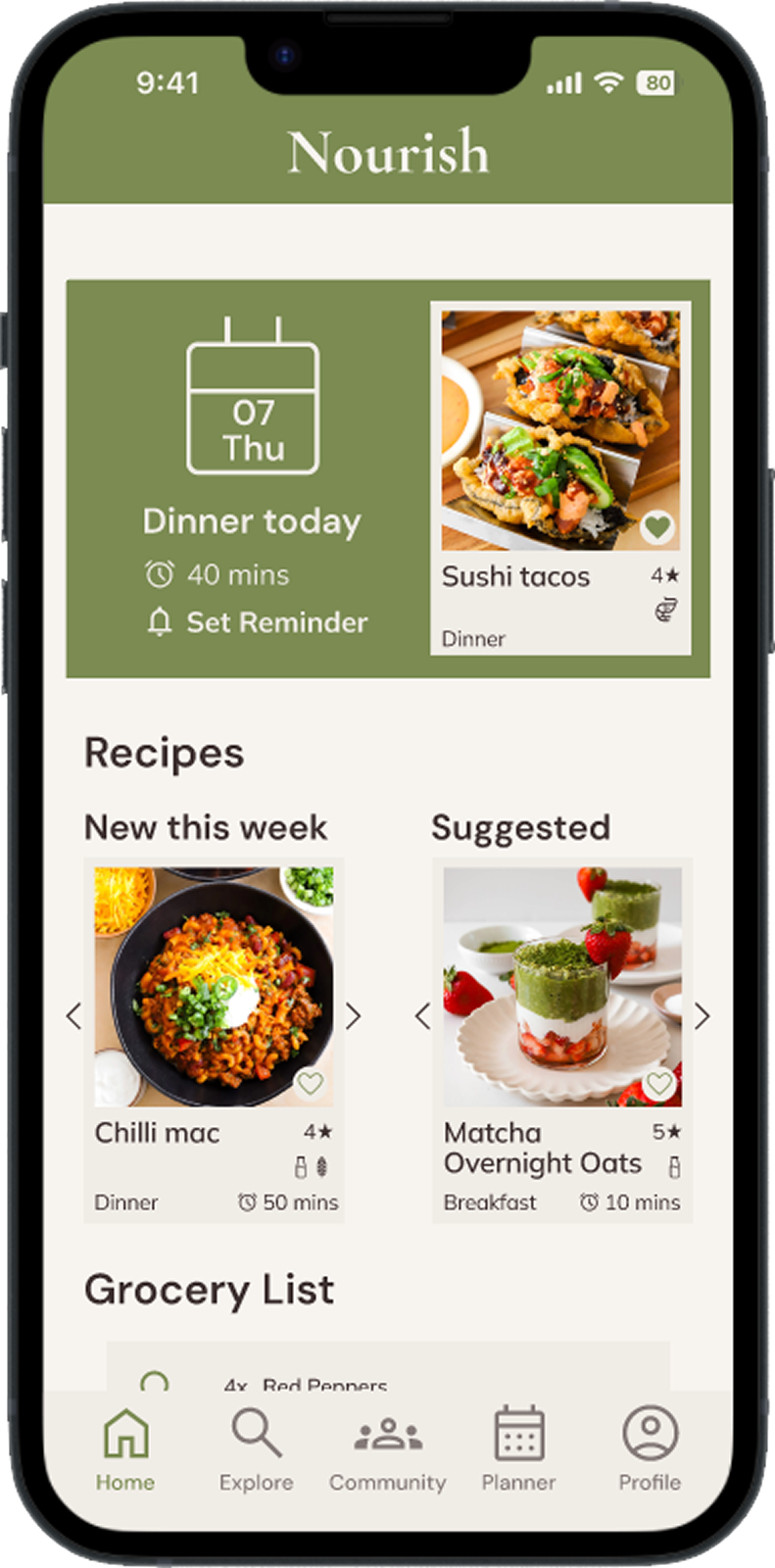
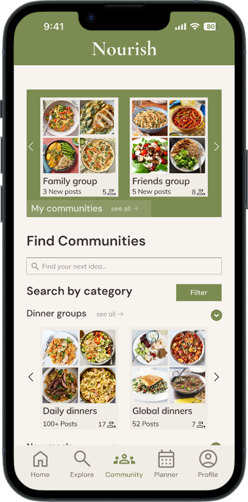
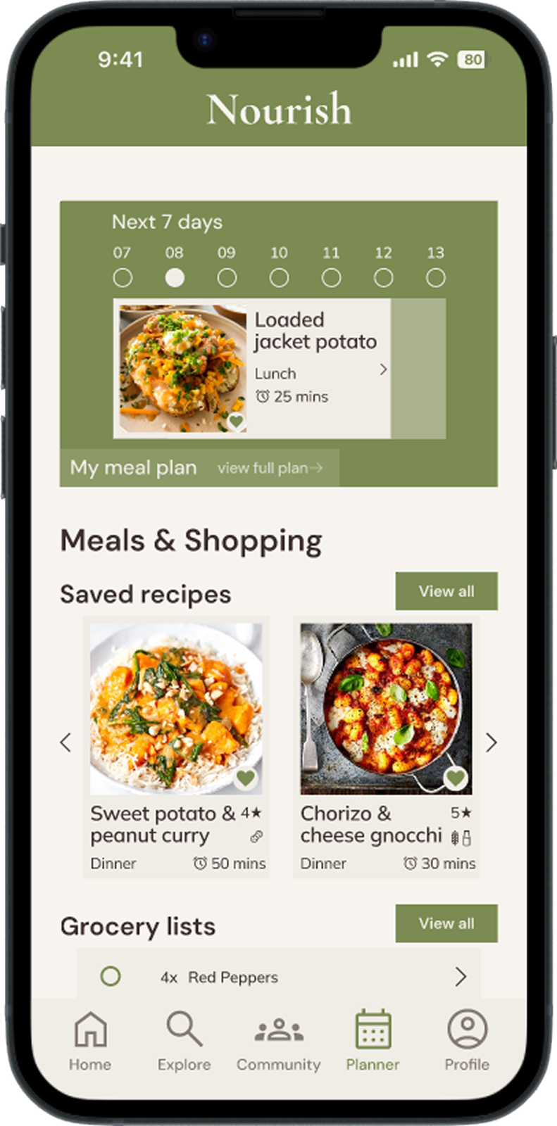
Following the usability tests I iterated my design to create a hi-fi mockup the addressed the feedback to create a better user experience. Swipe to see the difference!

Homepage

Explore

Community

Planner

Hi-Fi Design

Final Prototype

View Prototype in Figma
Reflection

Final thoughts & Looking Forward

Project Overview

This was my second UX design project, building on skills developed in my earlier work. A key strength was my early focus on exploring diverse solutions to user problems, which helped me identify the best solutions before moving to high-fidelity designs.
One main challenge was designing intuitive recipe exploration. I created a two-step filtering process where users first explore broad categories, then narrow down options once they understand what interests them. This approach made browsing feel more natural and less overwhelming.

Lessons Learnt

Early testing revealed crucial insights - Usability testing wireframes showed that users needed immediate access to their meal plan on the homepage, leading me to prioritise this feature for easier recipe access.
Thorough ideation accelerated design decisions - Sketching multiple solutions early gave me confidence in later stages, as I already understood which approaches worked and could focus on refining the strongest concepts.

Future Development

I've started "vibe coding" the app to test a working version, which has been incredibly valuable for understanding how the design translates to a functional product. This hands-on development process is revealing new insights about user interactions and technical feasibility that weren't apparent in static designs.
The most promising feature for expansion is the AI-powered meal plan generator. While I included a placeholder in my design, building it would involve creating a system that learns user preferences and generates personalised plans based on their goals, whether discovering new recipes or using favourites. This would significantly reduce the mental load for users who struggle with meal planning.

You might also like...